
Hope someone likes it

Attached Images
Edited by Calliea, 18 October 2009 - 04:03 PM.

Posted 18 October 2009 - 04:01 PM
Edited by Calliea, 18 October 2009 - 04:03 PM.

Posted 19 October 2009 - 12:45 PM
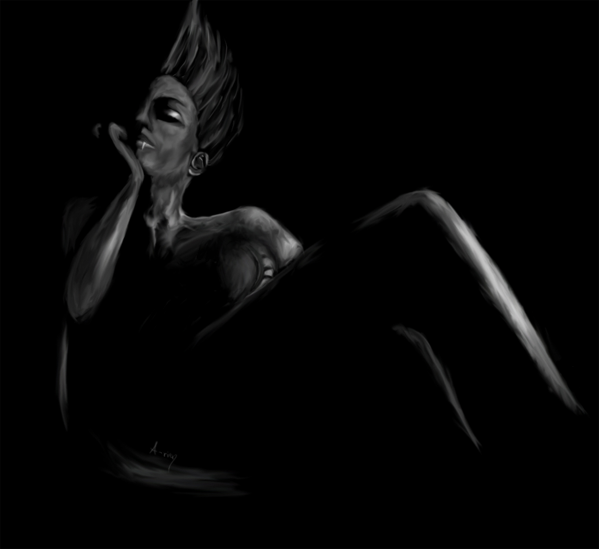
So yes, I just found these forums (quick, seeing that I've been lurking around for around three years (or maybe six, I'm not best with time-feel). I have one BG fanart I've made some time ago so I thought I might just as well paste it here for some criticism or whatnot. I know some imperfections already, but I've been trying the new style on it and I've noticed them only later when I could throw some fresh eye on them, if I could say that. Well
Hope someone likes it
You've got to be kidding me!
***
DA goes here
Posted 19 October 2009 - 02:00 PM
 Criticism is not a problem at all, it's most desired. Drawing this one took me around half an hour so I know that I've missed many details and I'm quite a newbie when it comes to light that is not straight on the face in the most kind-of-non-existent way.

Edited by Calliea, 19 October 2009 - 02:01 PM.

Posted 19 October 2009 - 02:30 PM
Nominal Member

Posted 24 October 2009 - 07:03 PM
. (I think there's more of that forearm than there needs to be; it looks a bit awkward as is).
AIR CONDITIONER GRILL

Posted 26 October 2009 - 02:10 PM
theacefes: You have to be realistic as well, you can't just be Swedish!


