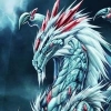
Anyway, here are my suggestions:

Forum banner alternatives
Started by T.G.Maestro, Jun 29 2005 12:19 AM
50 replies to this topic
#1

T.G.Maestro
-
- Member
- 4415 posts
Eclipse
Posted 29 June 2005 - 12:19 AM
As the title suggests - I'd like to see something along this line as a fitting forum banner. Sorry, but the current "Real Life Cathedral" theme is just out of concept IMO.
Anyway, here are my suggestions:
Anyway, here are my suggestions:


Refinements v2 has been released!
Go and visit the website or the forum for more info!
Member of The Silver Star team.
#2
Yacomo
-

- Member
- 485 posts
cartographer of the realms
Posted 29 June 2005 - 01:11 AM
Those are gorgeous! May I ask how you created them? They look like they were carefully crafted by hand, you are a very talented artist if this is indeed true 
If they are of use for anyone, I do have some renders for offer previously posted in this thread. Not as nice as the images above though
Edit: Though that thread linking is a little bit uggly, so copied the pictures over here.


If they are of use for anyone, I do have some renders for offer previously posted in this thread. Not as nice as the images above though
Edit: Though that thread linking is a little bit uggly, so copied the pictures over here.
Edited by Yacomo, 29 June 2005 - 01:38 AM.
Revised BP-BGT Worldmap (mirror) (mirror 2) (mirror 2) (discussion)
MosPack 0.92 (mirror)
Yacomo's Cave
MosPack 0.92 (mirror)
Yacomo's Cave
#3
jester
-

- Member
- 1476 posts
biased bystander
Posted 29 June 2005 - 01:25 AM
The first one is the most catchy for me, but could be hard to crop correctly.
Too vampire!
Too victorian!
Too victorian and streetlights!
Gret stuff TGM! Where did you get these? If you drew them yourself I know an assignment for you.
Too vampire!
Too victorian!
Too victorian and streetlights!
Gret stuff TGM! Where did you get these? If you drew them yourself I know an assignment for you.
"It's 106 miles to Arroyo, we got a full fusion cell, half a pack of RadAway, it's midnight, and I'm wearing a 50-year old Vault 13 Jumpsuit. Let's hit it!" -The Chosen One
Free your mind
Free your mind
#4
T.G.Maestro
-
- Member
- 4415 posts
Eclipse
Posted 29 June 2005 - 03:31 AM
I'm sorry if I disappoint you, but these are not my artwork - I'm not skilled enough yet to draw images of such high quality (at least not in colors, I'm fairly skilled with pencil'n'paper).
These pics were taken as samples from the artwork created for Thief3. Even if they turn out to be non-useable for a forum like this one, they can be used as a good example on what should work as an ideal forum banner - one that would truly fit the "Spellhold" theme.
EDIT: so far I haven't seen any statements on the thief3 site declaring that the use of these artwork is prohibited in any means.
Edited by T.G.Maestro, 29 June 2005 - 05:09 AM.
Refinements v2 has been released!
Go and visit the website or the forum for more info!
Member of The Silver Star team.
#5
Thorium Dragon
-
- Modder
-

- 408 posts
Hard at work...
Posted 29 June 2005 - 05:23 AM
I whipped this one up for my personal use, but I can share.
The water could be better and the font could be more interesting. But I don't think it's too bad for 10 minutes of work.
The water could be better and the font could be more interesting. But I don't think it's too bad for 10 minutes of work.
Attached Images

Edited by Thorium Dragon, 29 June 2005 - 05:24 AM.
Mod in Progress: Valen Expansion
#6
Archmage Silver
-
- Member
- 6654 posts
Master of The Art
Posted 29 June 2005 - 07:02 AM
@T.G I like the first one best this far. Maybe it would make at least the model that the banner is based on, who knows.

#7
T.G.Maestro
-
- Member
- 4415 posts
Eclipse
Posted 29 June 2005 - 10:36 AM
Again, I browsed the site (thief3 website), but haven't seen any warnings that these artwork cannot be used this way.
Refinements v2 has been released!
Go and visit the website or the forum for more info!
Member of The Silver Star team.
#8
jester
-
- Member
- 1476 posts
biased bystander
Posted 29 June 2005 - 11:00 AM
Try to cut them into banner size first. Bigger pictures can be very misleading when they show much more content, read judge them as banners.
"It's 106 miles to Arroyo, we got a full fusion cell, half a pack of RadAway, it's midnight, and I'm wearing a 50-year old Vault 13 Jumpsuit. Let's hit it!" -The Chosen One
Free your mind
Free your mind
#9
Userunfriendly
-

- Member
- 2175 posts
Replendent Beta Tester of Madness!!!
Posted 29 June 2005 - 03:15 PM
Try to cut them into banner size first. Bigger pictures can be very misleading when they show much more content, read judge them as banners.

agreed...i really like the sense of desolate isolation in the second one by tgm, and the one by thorium dragon...
if the cropped image of the second one by tgm still gives you that sense of desolate isolation, then it would be my vote.
They call me....
Darth...
Darth Gizka...
Darth...
Darth Gizka...
#10
T.G.Maestro
-
- Member
- 4415 posts
Eclipse
Posted 30 June 2005 - 12:11 AM
What is the opinion of the admins/GMs here? Any ideas?
Refinements v2 has been released!
Go and visit the website or the forum for more info!
Member of The Silver Star team.
#11
Shed
-

- Modder
-
- 2638 posts
-Shed-
Posted 30 June 2005 - 03:42 AM
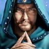
My personal opinion is that I quite like the first one you posted. I attach it resized. However, I'm a bit concerned that it's artwork for a copyrighted game, and that Thief 3 is not even a CRPG .
Anyone else with further suggestions or offerings, please give them here!
.Anyone else with further suggestions or offerings, please give them here!
Attached Images

Yikari, monk NPC
Shed's Mods - Three time TeamBG Contest winner!
The Jerry Zinger Show
ShedPlant.net
#12
T.G.Maestro
-
- Member
- 4415 posts
Eclipse
Posted 30 June 2005 - 04:36 AM
Looks good - could you please (or someone else) post the other ones resized as well? (I don't have the time ATM, sorry)My personal opinion is that I quite like the first one you posted. I attach it resized
Unless their use is prohibited by any means, we are free to use them.However, I'm a bit concerned that it's artwork for a copyrighted game
Refinements v2 has been released!
Go and visit the website or the forum for more info!
Member of The Silver Star team.
#13
Shed
-
- Modder
-
- 2638 posts
-Shed-
Posted 30 June 2005 - 04:42 AM
Sure, here are the others:
Attached Images


Yikari, monk NPC
Shed's Mods - Three time TeamBG Contest winner!
The Jerry Zinger Show
ShedPlant.net
#14
T.G.Maestro
-
- Member
- 4415 posts
Eclipse
Posted 30 June 2005 - 05:01 AM
While the last one doesn't look too got this way, the others are absolutely astounding - I could hardly decide between 1-2-3.
Refinements v2 has been released!
Go and visit the website or the forum for more info!
Member of The Silver Star team.
#15
Jyzabyl
-

- Member
- 1468 posts
Order of the Radiantly Radiant
Posted 30 June 2005 - 05:33 AM
I think the one with the full moon is fabulous. Full Moon leads to Lunacy leads to Asylum. 
True knowledge exists in knowing that you know nothing. And in knowing that you know nothing, that makes you the smartest of all. Socrates
Not only are female redheads frequently lovely but theirs is a loveliness that suggests both lust and danger, pleasure and violence, and is, therefore, to the male of the species virtually irresistible. Red O red were the tresses of the original femme fatale. Tom Robbins
The way to a man's heart is through his stomach. Unless you know anthing about anatomy. In that case the way to a man's heart is through his ribs with a meat cleaver. Miss Jyzzy's Guide to Men.
Xtreme Versatility? Xpress Yourself!
#16
T.G.Maestro
-
- Member
- 4415 posts
Eclipse
Posted 30 June 2005 - 05:37 AM
Yes, either that, or the first one are the best IMO.I think the one with the full moon is fabulous.
Refinements v2 has been released!
Go and visit the website or the forum for more info!
Member of The Silver Star team.
#17
jester
-
- Member
- 1476 posts
biased bystander
Posted 30 June 2005 - 05:52 AM
For anybody who does not know the original images I think everything but the lonely house with the moon is too weak. Perhaps it needs a little bit of hill underneath to show that it is actually towering like Spellhold is.
"It's 106 miles to Arroyo, we got a full fusion cell, half a pack of RadAway, it's midnight, and I'm wearing a 50-year old Vault 13 Jumpsuit. Let's hit it!" -The Chosen One
Free your mind
Free your mind
#18
Shed
-
- Modder
-
- 2638 posts
-Shed-
Posted 30 June 2005 - 07:00 AM
While the full moon banner is good, it doesn't go with the theme. Changing the theme (or an alternative theme) to Gothic black and blue would not be good, imo  . However, the first image is more red, brighter, and even contains books/spells .
. However, the first image is more red, brighter, and even contains books/spells .
Yikari, monk NPC
Shed's Mods - Three time TeamBG Contest winner!
The Jerry Zinger Show
ShedPlant.net
#19
T.G.Maestro
-
- Member
- 4415 posts
Eclipse
Posted 30 June 2005 - 07:34 AM
I wouldn't say that only black&blue would fit that one. Simply imagine a white (or silverish-white)/blue/black theme - it would work nicely. And other variations are possible as well to fit.While the full moon banner is good, it doesn't go with the theme. Changing the theme (or an alternative theme) to Gothic black and blue would not be good, imo
And, since we were already talking about multiple skins...

Anyway, here are a few extra artwork of the same cathegory:
Attached Images


Edited by T.G.Maestro, 30 June 2005 - 07:36 AM.
Refinements v2 has been released!
Go and visit the website or the forum for more info!
Member of The Silver Star team.
#20
jester
-
- Member
- 1476 posts
biased bystander
Posted 30 June 2005 - 08:08 AM
I think once you cut the library picture into just a bookshelf slice it looses its depth. As much as I like the picture as a whole I am not thrilled by the single bookshelf. 
"It's 106 miles to Arroyo, we got a full fusion cell, half a pack of RadAway, it's midnight, and I'm wearing a 50-year old Vault 13 Jumpsuit. Let's hit it!" -The Chosen One
Free your mind
Free your mind


