Edited by Enkida, 20 January 2012 - 02:50 PM.

Full Cyborg
Posted 18 January 2012 - 12:08 PM
Edited by Enkida, 20 January 2012 - 02:50 PM.
Fiction Enforcer
Posted 24 January 2012 - 10:14 AM


Edited by Lava Del'Vortel, 24 January 2012 - 11:35 AM.
Most of my mods are available at Weasel Mods
Done projects:
-Colours of Infinity: TotDG, Innershade, TWQ, ISNF, Yvette, Foundling
-Athkatlan Grounds: Southern Edge, Ooze's Lounge, Tangled Oak Isle
-Other Quests: Eilistraee's Song | Will of the Wisps | The Vanishing of Skie Silvershield | Shades of the Sword Coast
-Items, spells, tweaks: FindIt IWD | ForgeIt IWD | Weasels!
-NPCs and related: Varshoon | Aeon | Petsy | Tsuki BG2 | Yoshimo Romance | Quayle BG2 | Swylif | Skie: The Cost of One Girl's Soul | Hephernaan BG2 | White | Gahesh | Will | Verr'Sza BG1EE | Verr'Sza BG2EE | Wilson Chronicles | Bristlelick | Walahnan BG1EE | Walahnan BG2EE | Khalid BG2EE
-IWD EE Modd: Dusky NPC | Dendjelion NPC | Ina NPC | Oak-Maw NPC | Orra NPC | Tipps NPC | T'viy NPC | Urchin NPC | L'anna | Hommet | ToOLD | TotS | NotBD | B&B Inn | TRoK
Contribution: PaintBG | Ilmatar's Portrait Pack | InfinityKits | Sarevok Friendship | Haer'Dalis Friendship | Cernd Friendship | Valygar Friendship | Sellswords | Fade | BG1 Romantic Encounters | Viconia Revamped
Full Cyborg
Posted 24 January 2012 - 03:41 PM
Fiction Enforcer
Posted 24 January 2012 - 03:52 PM
Most of my mods are available at Weasel Mods
Done projects:
-Colours of Infinity: TotDG, Innershade, TWQ, ISNF, Yvette, Foundling
-Athkatlan Grounds: Southern Edge, Ooze's Lounge, Tangled Oak Isle
-Other Quests: Eilistraee's Song | Will of the Wisps | The Vanishing of Skie Silvershield | Shades of the Sword Coast
-Items, spells, tweaks: FindIt IWD | ForgeIt IWD | Weasels!
-NPCs and related: Varshoon | Aeon | Petsy | Tsuki BG2 | Yoshimo Romance | Quayle BG2 | Swylif | Skie: The Cost of One Girl's Soul | Hephernaan BG2 | White | Gahesh | Will | Verr'Sza BG1EE | Verr'Sza BG2EE | Wilson Chronicles | Bristlelick | Walahnan BG1EE | Walahnan BG2EE | Khalid BG2EE
-IWD EE Modd: Dusky NPC | Dendjelion NPC | Ina NPC | Oak-Maw NPC | Orra NPC | Tipps NPC | T'viy NPC | Urchin NPC | L'anna | Hommet | ToOLD | TotS | NotBD | B&B Inn | TRoK
Contribution: PaintBG | Ilmatar's Portrait Pack | InfinityKits | Sarevok Friendship | Haer'Dalis Friendship | Cernd Friendship | Valygar Friendship | Sellswords | Fade | BG1 Romantic Encounters | Viconia Revamped

Posted 24 January 2012 - 09:24 PM
Edited by Justify, 24 January 2012 - 09:25 PM.
Fiction Enforcer
Posted 25 January 2012 - 08:06 AM
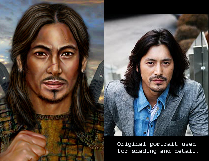
 I will try to fix a thing or two Probably the shading and will give hair a shot! I'm not sure what will be the result, but...
Most of my mods are available at Weasel Mods
Done projects:
-Colours of Infinity: TotDG, Innershade, TWQ, ISNF, Yvette, Foundling
-Athkatlan Grounds: Southern Edge, Ooze's Lounge, Tangled Oak Isle
-Other Quests: Eilistraee's Song | Will of the Wisps | The Vanishing of Skie Silvershield | Shades of the Sword Coast
-Items, spells, tweaks: FindIt IWD | ForgeIt IWD | Weasels!
-NPCs and related: Varshoon | Aeon | Petsy | Tsuki BG2 | Yoshimo Romance | Quayle BG2 | Swylif | Skie: The Cost of One Girl's Soul | Hephernaan BG2 | White | Gahesh | Will | Verr'Sza BG1EE | Verr'Sza BG2EE | Wilson Chronicles | Bristlelick | Walahnan BG1EE | Walahnan BG2EE | Khalid BG2EE
-IWD EE Modd: Dusky NPC | Dendjelion NPC | Ina NPC | Oak-Maw NPC | Orra NPC | Tipps NPC | T'viy NPC | Urchin NPC | L'anna | Hommet | ToOLD | TotS | NotBD | B&B Inn | TRoK
Contribution: PaintBG | Ilmatar's Portrait Pack | InfinityKits | Sarevok Friendship | Haer'Dalis Friendship | Cernd Friendship | Valygar Friendship | Sellswords | Fade | BG1 Romantic Encounters | Viconia Revamped

Posted 25 January 2012 - 01:57 PM
Edited by Rhaella, 25 January 2012 - 01:59 PM.
Fiction Enforcer
Posted 25 January 2012 - 02:06 PM
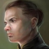
 I made some changes to get rid of the cheek edge I was overdoing. Are those better? Liam? Enkida? Justify? Other people? Or maybe you really preffered previous version?

Edited by Lava Del'Vortel, 25 January 2012 - 02:18 PM.
Most of my mods are available at Weasel Mods
Done projects:
-Colours of Infinity: TotDG, Innershade, TWQ, ISNF, Yvette, Foundling
-Athkatlan Grounds: Southern Edge, Ooze's Lounge, Tangled Oak Isle
-Other Quests: Eilistraee's Song | Will of the Wisps | The Vanishing of Skie Silvershield | Shades of the Sword Coast
-Items, spells, tweaks: FindIt IWD | ForgeIt IWD | Weasels!
-NPCs and related: Varshoon | Aeon | Petsy | Tsuki BG2 | Yoshimo Romance | Quayle BG2 | Swylif | Skie: The Cost of One Girl's Soul | Hephernaan BG2 | White | Gahesh | Will | Verr'Sza BG1EE | Verr'Sza BG2EE | Wilson Chronicles | Bristlelick | Walahnan BG1EE | Walahnan BG2EE | Khalid BG2EE
-IWD EE Modd: Dusky NPC | Dendjelion NPC | Ina NPC | Oak-Maw NPC | Orra NPC | Tipps NPC | T'viy NPC | Urchin NPC | L'anna | Hommet | ToOLD | TotS | NotBD | B&B Inn | TRoK
Contribution: PaintBG | Ilmatar's Portrait Pack | InfinityKits | Sarevok Friendship | Haer'Dalis Friendship | Cernd Friendship | Valygar Friendship | Sellswords | Fade | BG1 Romantic Encounters | Viconia Revamped
Posted 25 January 2012 - 02:35 PM
Full Cyborg
Posted 25 January 2012 - 02:40 PM
Edited by Enkida, 25 January 2012 - 02:50 PM.
Fiction Enforcer
Posted 25 January 2012 - 02:55 PM
Most of my mods are available at Weasel Mods
Done projects:
-Colours of Infinity: TotDG, Innershade, TWQ, ISNF, Yvette, Foundling
-Athkatlan Grounds: Southern Edge, Ooze's Lounge, Tangled Oak Isle
-Other Quests: Eilistraee's Song | Will of the Wisps | The Vanishing of Skie Silvershield | Shades of the Sword Coast
-Items, spells, tweaks: FindIt IWD | ForgeIt IWD | Weasels!
-NPCs and related: Varshoon | Aeon | Petsy | Tsuki BG2 | Yoshimo Romance | Quayle BG2 | Swylif | Skie: The Cost of One Girl's Soul | Hephernaan BG2 | White | Gahesh | Will | Verr'Sza BG1EE | Verr'Sza BG2EE | Wilson Chronicles | Bristlelick | Walahnan BG1EE | Walahnan BG2EE | Khalid BG2EE
-IWD EE Modd: Dusky NPC | Dendjelion NPC | Ina NPC | Oak-Maw NPC | Orra NPC | Tipps NPC | T'viy NPC | Urchin NPC | L'anna | Hommet | ToOLD | TotS | NotBD | B&B Inn | TRoK
Contribution: PaintBG | Ilmatar's Portrait Pack | InfinityKits | Sarevok Friendship | Haer'Dalis Friendship | Cernd Friendship | Valygar Friendship | Sellswords | Fade | BG1 Romantic Encounters | Viconia Revamped
Posted 25 January 2012 - 06:53 PM
Fiction Enforcer
Posted 25 January 2012 - 07:13 PM
Most of my mods are available at Weasel Mods
Done projects:
-Colours of Infinity: TotDG, Innershade, TWQ, ISNF, Yvette, Foundling
-Athkatlan Grounds: Southern Edge, Ooze's Lounge, Tangled Oak Isle
-Other Quests: Eilistraee's Song | Will of the Wisps | The Vanishing of Skie Silvershield | Shades of the Sword Coast
-Items, spells, tweaks: FindIt IWD | ForgeIt IWD | Weasels!
-NPCs and related: Varshoon | Aeon | Petsy | Tsuki BG2 | Yoshimo Romance | Quayle BG2 | Swylif | Skie: The Cost of One Girl's Soul | Hephernaan BG2 | White | Gahesh | Will | Verr'Sza BG1EE | Verr'Sza BG2EE | Wilson Chronicles | Bristlelick | Walahnan BG1EE | Walahnan BG2EE | Khalid BG2EE
-IWD EE Modd: Dusky NPC | Dendjelion NPC | Ina NPC | Oak-Maw NPC | Orra NPC | Tipps NPC | T'viy NPC | Urchin NPC | L'anna | Hommet | ToOLD | TotS | NotBD | B&B Inn | TRoK
Contribution: PaintBG | Ilmatar's Portrait Pack | InfinityKits | Sarevok Friendship | Haer'Dalis Friendship | Cernd Friendship | Valygar Friendship | Sellswords | Fade | BG1 Romantic Encounters | Viconia Revamped
Posted 25 January 2012 - 07:58 PM

Posted 26 January 2012 - 11:15 AM
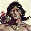
But look at the result of the tutorial. That girl has no face lines. I don't find her baldurized - even in cathegory of her skin alone. I would rather leave them some lines. I knoe that I might have overdid the shadows on their cheeks in previous versions, but I'm not really happy with the fact some of the portraits are loosing the lines, in some of the portraits. I really believe that 'mundane lady' was better in previous version, with some lines and light. She's a bit flat now...
Full Cyborg
Posted 26 January 2012 - 11:53 AM
Edited by Enkida, 26 January 2012 - 11:54 AM.
Fiction Enforcer
Posted 26 January 2012 - 12:20 PM
I was to send you a message, so you will get some meterials and descriptions in the PM, ok? 
Most of my mods are available at Weasel Mods
Done projects:
-Colours of Infinity: TotDG, Innershade, TWQ, ISNF, Yvette, Foundling
-Athkatlan Grounds: Southern Edge, Ooze's Lounge, Tangled Oak Isle
-Other Quests: Eilistraee's Song | Will of the Wisps | The Vanishing of Skie Silvershield | Shades of the Sword Coast
-Items, spells, tweaks: FindIt IWD | ForgeIt IWD | Weasels!
-NPCs and related: Varshoon | Aeon | Petsy | Tsuki BG2 | Yoshimo Romance | Quayle BG2 | Swylif | Skie: The Cost of One Girl's Soul | Hephernaan BG2 | White | Gahesh | Will | Verr'Sza BG1EE | Verr'Sza BG2EE | Wilson Chronicles | Bristlelick | Walahnan BG1EE | Walahnan BG2EE | Khalid BG2EE
-IWD EE Modd: Dusky NPC | Dendjelion NPC | Ina NPC | Oak-Maw NPC | Orra NPC | Tipps NPC | T'viy NPC | Urchin NPC | L'anna | Hommet | ToOLD | TotS | NotBD | B&B Inn | TRoK
Contribution: PaintBG | Ilmatar's Portrait Pack | InfinityKits | Sarevok Friendship | Haer'Dalis Friendship | Cernd Friendship | Valygar Friendship | Sellswords | Fade | BG1 Romantic Encounters | Viconia Revamped
Full Cyborg
Posted 26 January 2012 - 01:14 PM
Posted 26 March 2012 - 08:12 AM
Working and playing on a Mac Pro 6,1 running Mac OS X 10.13.6 High Sierra, and a Mac Pro 3,1 running Mac OS X 10.11.6 El Capitan.
~Buion na 'ell! I serve with joy! Your eyes and ears I shall be. Let us hunt together!~
- Erysseril Gwaethorien: a joinable, romanceable NPC mod for BGII - SoA/ToB, in sporadic development.
A female elf warrior of nature and a Bhaalspawn cross paths during their quests, joining forces to share adventure and companionship. Will they find more?