
Some portrait work
Started by
-RJH-
, Sep 06 2007 04:20 PM
19 replies to this topic
#1
 -RJH-
-RJH-
-RJH-
-

- Guest
Posted 06 September 2007 - 04:20 PM
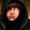
What do ya think of these so far. Some are newly made from mishmashing pics together etcin photoshop, some are edits of originals or existing edits etc. Neway..........

#2
Ilmatar
-

- Member
- 2172 posts
is not here anymore.
Posted 06 September 2007 - 07:55 PM
Just making sure - were all of these edits made by yourself?
Ilmatar's portraits for the Baldur's Gate series ¤ | ¤ | ¤ Ahem. Ilmatar =/= Ilmater. ¤ | ¤ | ¤ deviantART gallery
Grunting is a perfectly acceptable reaction to being struck with a blunt instrument. -berelinde
And, just out of curiosity, my dear, what *are* you wearing?  - Tempest to me.
#3

Posted 06 September 2007 - 08:47 PM
Some of these pictures are Plasmocat's work...she clearly states she doesn't want anyone to edit her pictures in her readmes. I really wish people would ask premission to the artist before doing edits...especially when half of the edits are really botchy work of great pictures. (I am sure people will dislike me for this comment but I think this topic should be removed(or at least the link) because many of the pictures are edits of Plasmocat's work. I know her personally...she will never give premission to edit or use her work. Liam I think you can back me up on this one.) Many of these pictures come from her BG portrait pack which is hosted at the gibberings three and on the Classic Adventures homepage.
Longing for the old pen and paper modules of the 70's and 80's. Experience AD&D's greatest adventures using the infinity engine: Visit our homepage at http://classicadventuresmod.com/
#4
-RJH-
-RJH-
-
- Guest
Posted 06 September 2007 - 08:49 PM
Just making sure - were all of these edits made by yourself?
A few were existing edits that I edited further. Added a weapon, some effect or screwed with colour or clothing ya know.
The brand new ones mostly at the top are just made from composites of many pieces of existing art. A models face, clothing, a weapon n so on all blended together.
#5
Posted 06 September 2007 - 09:17 PM
You should ask premission before editing other people's pictures. I know Plasmocat will ask you to remove her pictures from your pack as soon as she learns of this. Please note anything you see on the Classic Adventures homepage is NOT for your editing needs. You do not have our premission. I kindly ask you to remove any of the BG1 portrait pack which you have edited.
Edited by leahnkain, 06 September 2007 - 09:19 PM.
Longing for the old pen and paper modules of the 70's and 80's. Experience AD&D's greatest adventures using the infinity engine: Visit our homepage at http://classicadventuresmod.com/
#6
Deathsangel
-

- Modder
-

- 3089 posts
Living on Wings of Dreams
Posted 07 September 2007 - 01:32 AM
Outside the points of Ilmatar and Ieahnkain, which are very valid and I indeed can see plasmocat's work (like BG1 portrait pack), I like some of the spellcasting effects, though at some points a bit over the top. I also enjoy portait 2 to 6 in the 2nd row... but I don't know if they are plasmocat related...
Edit: Sorry for typo's
Edit: Sorry for typo's
Edited by Deathsangel, 07 September 2007 - 01:39 AM.
Still modding the Mod for the Wicked... It is a big project you know... And I got sidetracked (several times) a bit... sorry.
However, as we all know, Evil never really sleeps.
Sentences marking (my) life:
Winds of change... Endure them, and in Enduring grow Stronger
It takes a fool to look for logic in a man's heart
Never question the sanity of the insane
The Harmony of Life is Chaos
Living on Wings of Dreams
(1st march 2009) SHS women over me:
Kat: if there were more guys that looked like you out here, people's offspring wouldnt be so damn ugly
Noctalys: you are adorable 
~~ I love it, and I am humbled! Yay! ~~
#7
-RJH-
-RJH-
-
- Guest
Posted 07 September 2007 - 01:37 AM
You should ask premission before editing other people's pictures. I know Plasmocat will ask you to remove her pictures from your pack as soon as she learns of this. Please note anything you see on the Classic Adventures homepage is NOT for your editing needs. You do not have our premission. I kindly ask you to remove any of the BG1 portrait pack which you have edited.
And at what stage did I say it was a pack?
I just added weapons or effects to the best existing versions of portraits to save time and to make them a little more interesting or dynamic, call it what you will and wanted to see if people digged that or not. Seemed pointless for me to do exactly the same initial edits to the pics that had already been done and then add weapons and mess with lighting etc and waste my time. I'm obviously not gonna get any feedback on that front.
I'm pretty sure Matthew Goldman never had a paddy when people edited his bg art for the better
#8
-RJH-
-RJH-
-
- Guest
Posted 07 September 2007 - 02:14 AM
Okay, got the magic rubber out, bg1 ones have turned a nice shade of black heh.
#9
Kaeloree
-
- Administrator
-

- 9202 posts
Head Molder
Posted 07 September 2007 - 02:48 AM
I've edited your original post to include the new version. Thanks!  I'm sorry that your first experiences with posting at SHS have been met with this, and I hope that you continue posting your work - the original portraits there are fantastic, especially one down three across from left, just gorgeous.
I'm sorry that your first experiences with posting at SHS have been met with this, and I hope that you continue posting your work - the original portraits there are fantastic, especially one down three across from left, just gorgeous.
- Liam
Modding Projects
Complete:
Arath NPC - Nephele NPC - Xulaye NPC - Iylos NPC - Ninde NPC - Darian NPC - Yeslick NPC - Adrian NPC - Dace NPC - Valerie NPC - Isra NPC
Viconia Friendship - Mazzy Friendship - Imoen Friendship - Yoshimo Friendship - Sarevok Friendship - Neera Expansion
IEP Extended Banter
Sarevok Romance
Haer'Dalis Romance
In Progress:
Khadion NPC - Delainy NPC - Sarine NPC
#10
-RJH-
-RJH-
-
- Guest
Posted 07 September 2007 - 04:38 AM
No worries, all valid points i'm sure heh
Glad you like em. I have quite a few more on the go. I'll post them here in time.
Glad you like em. I have quite a few more on the go. I'll post them here in time.

#12
Ibis
-

- Member
- 114 posts
moonlit sleepless florida nights
Posted 07 September 2007 - 09:54 AM
Very nice, I really do like the effect of the weapon or the spellcaste on the portrait ... it's a good look. I'm glad you got straightened out on the permissions thing. It is important.
That is why all my display work I don't want copied online has my large initials painted somewhere on it, or says Sunburst Studio in the middle of the painting or some such text that makes the painting clearly seen but unusable for any copying purposes. If someone wishes to purchase or I email a painiting to a friend, then they get the clear unedited painting.
That is why all my display work I don't want copied online has my large initials painted somewhere on it, or says Sunburst Studio in the middle of the painting or some such text that makes the painting clearly seen but unusable for any copying purposes. If someone wishes to purchase or I email a painiting to a friend, then they get the clear unedited painting.
Remember the Glory Days of Morrowind Mods? Visit Gamersroam Archival Download Library of 1032 old Morrowind Mods and take your pick. Just register and enjoy the good ole days!
#13
-RJH-
-RJH-
-
- Guest
Posted 10 September 2007 - 03:52 AM
A few touches and a sean bean baldurized image I cooked up and rather like.


#14
Deathsangel
-
- Modder
-
- 3089 posts
Living on Wings of Dreams
Posted 10 September 2007 - 05:02 AM
I really enjoy some as I said before.
What I would like to say, and hope you don't mind a bit of criticism
I think Edwin has a bit too much magic
I think you meant to make Cernd in some transition state, however, it doesn't entrily seem correct as it is seems IMO scally rather than furry
Nalia eyes seem to look two different ways.
One I love are (first number row, second number in row counting from left)
1-4, 1-5, 1-7
2-2, 2-3, 2-4, 2-5
3-6, 3-7
Still modding the Mod for the Wicked... It is a big project you know... And I got sidetracked (several times) a bit... sorry.
However, as we all know, Evil never really sleeps.
Sentences marking (my) life:
Winds of change... Endure them, and in Enduring grow Stronger
It takes a fool to look for logic in a man's heart
Never question the sanity of the insane
The Harmony of Life is Chaos
Living on Wings of Dreams
(1st march 2009) SHS women over me:
Kat: if there were more guys that looked like you out here, people's offspring wouldnt be so damn ugly
Noctalys: you are adorable
~~ I love it, and I am humbled! Yay! ~~
#15
-RJH-
-RJH-
-
- Guest
Posted 10 September 2007 - 07:06 AM
Nice points, I agree with all of em and have made changes. The cross eyed chick was acrually taken from a real model's face so she needs to go n see an optician me thinks heh.


#16
princesspurpleblob
-

- Member
- 329 posts
Princess
Posted 10 September 2007 - 11:50 PM
they are really nice. I like girl in center of 2nd row the best
#17
-RJH-
-RJH-
-
- Guest
Posted 13 September 2007 - 08:31 AM
A few more alterations, mainly to the mazzy face and also the repainted bill goldberg portrait.


#19
RedTyga
-

- Member
- 102 posts
Posted 15 September 2007 - 07:20 AM
Nice portrait edits. I really like some of these (especially the Goldberg one), but if you don't mind an extra critique then I would like to give one. If you do then ignore the rest of this post 
I think one of the things that bugs me about some portraits are the edited eyes. I can tell they're edited because they have those white dots in the middle of them and/or the white part of thier eyes are just that, completely white. It gives them this fake quality about them because the rest of their face has shadow, but their eyes look as shiny as pearls. If you look at say the Edwin edit, he doesn't have that white dot to give his eyes that shine and the white part of his eyes actually isn't solid white or even white at all. None of the BG portraits up there have solid white eyes, there's shadow in them that suggests that their eyes do belong to that face. I think that's the problem with some of the other edited portraits.
IMO, one's that should be changed and should either get rid of the white dot or dim that dot down so it's not completely white and/or give their eyes shadows, especially the white part of people's eyes to make them mesh with the rest of their face are:
(Counting from left to right) 1, 2, 3, 14, and 15
Besides that, some of other portraits' eyes seem odd for different reasons. Portrait 7 looks like he has a lazy eye because the eye on the left looks like it's looking to the left while the eye on the right looks like it's facing dead center. You can fix that problem by moving either the iris on the right to look to the left (And therefore adding more white space to right of that iris) or by moving the left iris more to the center of that eye and adding more white space to the left of that iris.
Portrait 12 looks like he is cross-eyed simply because there is not enough space between his irises and the inner part of his eyes (i.e. the end of his eyes that are closest to his nose).
Other than those portraits though, most of them look good and I'd like to see where you go with them when you're finished.
#20
-RJH-
-RJH-
-
- Guest
Posted 15 September 2007 - 11:47 AM
The eyes were kinda done on purpose. I kinda like the way theye stood out as a centre piece even though they shouldn't. I'll alter a few and see what they look like. I'll look in to your other comments too, thx.


