Jump to content


Photo

Das Neues Legion Sketch Thread


  • Please log in to reply
159 replies to this topic

#141 Silinde Ar-Feiniel

Silinde Ar-Feiniel
  • Member
  • 488 posts

Posted 02 June 2009 - 03:29 AM

Lol, that's very interesting! :lol: 
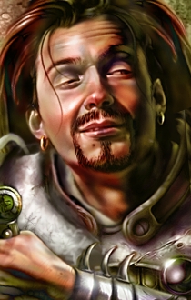
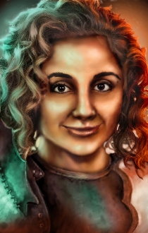
Great work on the lights! The only thingy is that the left side of the armor compared to the rigth, seems a bit weird... but I can't really explain it lol I think all other mixes are great and seem very natural. haha :D

If you want to alter reality, you must first escape from it.

My Deviant Art account

#142 WeeRLegion

WeeRLegion

    TFP : D

  • Member
  • 2925 posts

Posted 02 June 2009 - 03:46 AM

Oi, ye be right. Um, sorta fixed it now. o_o

Attached Images

  • ARMRELJ.jpg


#143 Silinde Ar-Feiniel

Silinde Ar-Feiniel
  • Member
  • 488 posts

Posted 02 June 2009 - 04:28 AM

I think maybe it's better now but I'm not sure that this was what I meant XD I was speaking on that thingy that is like colar around the neck. It looks too small compared to the right side. Also there's a totally gray small area in the middle of the armor. I guess with copy+paste and smudge from a random metal plate point it's an easy fix. ;)

If you want to alter reality, you must first escape from it.

My Deviant Art account

#144 Epantiras

Epantiras

    Proudly Chaotic Neutral

  • Member
  • 810 posts

Posted 02 June 2009 - 07:06 AM

Lol hair XD
sorry I could't resist
I think there's something weird with light sources, I mean the lower part of his arm is green and I'd expect this green light to be on his right cheek as well, while it's on his left instead.

oO My DA Gallery Oo
oO My Artcorner on SHS Oo
oO "Ask the Betrayer" parody comic Oo
oO My other parody comics on SHS Oo


Oh, and Epantiras, you're simply Epantirastic.

(and no, I'M not egocentric!)

I Hate Elminster! (proud member of the We Hate Elminster club)

#145 WeeRLegion

WeeRLegion

    TFP : D

  • Member
  • 2925 posts

Posted 02 June 2009 - 07:29 AM

You're just jealous of his magnificient hair. >.p


Fixed the light. Umm. The collar's a bit more work, I'd have to redraw it to make it match... it's kinda weird though, it's smaller even in the standard portrait, weeeird... (omg how lazy I am xP) o_o

Attached Images

  • ARMRELJ.jpg


#146 Aliya

Aliya

    Pink-Eyed Menace!

  • Member
  • 1619 posts

Posted 02 June 2009 - 08:16 AM

Now that's interesting!

#147 WeeRLegion

WeeRLegion

    TFP : D

  • Member
  • 2925 posts

Posted 11 June 2009 - 04:07 AM

So I was just fooling around with this thing called baldurization...

This here is Dave Batista, baldurized. He's dressed in a pair of photo cuts from a medieval armor shop, all thoroughly airbrushed over, and then spiced up with additional color layers to bring in some BG feel.

The procedure is still in need of refinement and polish, but methinks it's looking decent enough so far. Of course the original pic was real good with the shadows and everything, so there wasn't that much work, but ehheh.


The size is awkward cause I THOUGHT I remembered the correct measurements for a L-size portrait, but what I remembered was actually a mix of L&M values. So it's sorta useless, but whatever. .p


*And the colors don't fit the background. I've still got plenty of work on that front.
**Hm. Closer inspection reveals that I probably picked the wrong shading color. Ah well.
***Evaluated as a pic worth looknig at, sure, that's utter garbage, but as an experiment, I'm happy with the results. .p

Attached Images

  • BATISTALJ.jpg

Edited by WeeRLegion, 11 June 2009 - 08:30 AM.


#148 Epantiras

Epantiras

    Proudly Chaotic Neutral

  • Member
  • 810 posts

Posted 11 June 2009 - 12:55 PM

Looks good imo. The blue spot in the shadows is a little weird but who cares ;-)

oO My DA Gallery Oo
oO My Artcorner on SHS Oo
oO "Ask the Betrayer" parody comic Oo
oO My other parody comics on SHS Oo


Oh, and Epantiras, you're simply Epantirastic.

(and no, I'M not egocentric!)

I Hate Elminster! (proud member of the We Hate Elminster club)

#149 Leila

Leila
  • Member
  • 146 posts

Posted 11 June 2009 - 10:54 PM

The armor is great, and overall it looks well done, even if the lighting is a bit too stark for a baldurised portrait. Or at least, a BG2 portrait. It fits in very well with the BG1 style.

#150 WeeRLegion

WeeRLegion

    TFP : D

  • Member
  • 2925 posts

Posted 12 June 2009 - 04:43 AM

Thanks. :]

So I've been tinkering some more withmy work method. And I have discovered that I pretty much have no such thing as a work method and making this shit is just a helluva lot of work and pain. .p
Indeed, most stuff is best done by hand, blurs etc. only make a mess of things. x_x

The lighting is again a bit too extreme, but otherwise I think it's looking better. :]

The face belongs to Susi Kentikian, thus far undefeated fly-weight boxer (with 16 KO's of 24 victorious matches *drool*).


*The hair was a pain in the arse to de-photorealize. Too many tiny details. @_@
**And I just noticed the shading at the hairline does not match the shading on the hair-side of the hair-line. xO

Attached Images

  • SusiL.jpg

Edited by WeeRLegion, 12 June 2009 - 04:45 AM.


#151 Silinde Ar-Feiniel

Silinde Ar-Feiniel
  • Member
  • 488 posts

Posted 12 June 2009 - 05:14 AM

Do you drew the armor? It looks really amazing! :clap: 
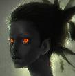
The face seems a bit weird though. One thingy is that the hair should be a little more down on the forehead. (let's say about 1/3 of forehead IMO). Another thingy is that maybe her characteristics match better on darker colors of skin (as her original color). But it's up to you to decide the color you like. As about the lighting, I'm afraid it kills the natural color but I agree that it's awesome and I like it very much! :D

If you want to alter reality, you must first escape from it.

My Deviant Art account

#152 WeeRLegion

WeeRLegion

    TFP : D

  • Member
  • 2925 posts

Posted 12 June 2009 - 05:20 AM

Just brushed over it m8. .p

It's just a baldurization; a chop & paint-over from medieval armor shoppes + Kentikian's face.
I did make a few little modifications to make it all fit together neat.
Hmm.
I wonder, it's possible that I accidentally pushed up the hairline while painting over the face, but eh, it's quite clsoe to where it used to be still.

@_@

Here's the original face pic: http://www.5machtfit...i_Kentikian.jpg


*Minor fixes
**Ah, the hair thingy is simply that the shading narrows her face down a bit, which makes it look as if the hairline was higher than it should.
***Add L, M, S .bmps in a RAR file in case anyone's interested. .p

Attached Images

  • SusiL3.jpg

Attached Files


Edited by WeeRLegion, 14 June 2009 - 12:55 PM.


#153 Silinde Ar-Feiniel

Silinde Ar-Feiniel
  • Member
  • 488 posts

Posted 12 June 2009 - 06:29 AM

Anyway, the baldurization of the armor is perfect then! ;) 
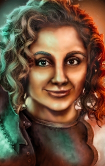
The new version looks somewhat better too, the shadows match better now!

If you want to alter reality, you must first escape from it.

My Deviant Art account

#154 Choo Choo

Choo Choo

    AIR CONDITIONER GRILL

  • Modder
  • 3001 posts

Posted 13 June 2009 - 10:44 AM

Except for the eyebrows, which look a bit one-coloured and don't mesh well with the softness of the face and hair, they stand out too much, it's a very good portrait.

theacefes: You have to be realistic as well, you can't just be Swedish!


#155 WeeRLegion

WeeRLegion

    TFP : D

  • Member
  • 2925 posts

Posted 14 June 2009 - 09:33 AM

Thanksies! :]


Ah, good spotting with the eyebrows, I might have to do something about that once I recover from travel fatigue. @_@

#156 Leila

Leila
  • Member
  • 146 posts

Posted 14 June 2009 - 02:43 PM

Ooh, that looks great! Once you fix the eyebrows I may have to replace Mazzy's portrait. :3 Some minor nitpicks, if you don't mind... you might want to reflect the green/orange lighting in her eyes. Also, the right side (our right) of her neck looks odd. I don't know if it's her hair blocking it. If it is, it needs to be shaded much more. If there isn't anything blocking it, it needs to be thickened a little on the top. As it is, it seems to have an unnatural bump. o.o

But aside from that... -swoon!- Looks awesome. I love your use of coloured lighting. It's reminiscent of the BG1 portraits, which I prefer immensely. :3

#157 WeeRLegion

WeeRLegion

    TFP : D

  • Member
  • 2925 posts

Posted 15 June 2009 - 01:18 AM

Such comments speed up the fixing process greatly. :3


Yeah, compared to BG 1, BG 2 portraits almost look sloppy. o_o


*I added a faint hint of an reflection of the light into her eyes, but eh, the lighting isa bit extreme, anything more and it'll quickly start looking quite wild. .p

Attached Images

  • SusiL4.jpg

Attached Files


Edited by WeeRLegion, 15 June 2009 - 01:19 AM.


#158 Epantiras

Epantiras

    Proudly Chaotic Neutral

  • Member
  • 810 posts

Posted 15 June 2009 - 03:44 AM

Looks better now ^_^

oO My DA Gallery Oo
oO My Artcorner on SHS Oo
oO "Ask the Betrayer" parody comic Oo
oO My other parody comics on SHS Oo


Oh, and Epantiras, you're simply Epantirastic.

(and no, I'M not egocentric!)

I Hate Elminster! (proud member of the We Hate Elminster club)

#159 Leila

Leila
  • Member
  • 146 posts

Posted 15 June 2009 - 10:31 AM

Much better. ^^ Good job!

#160 WeeRLegion

WeeRLegion

    TFP : D

  • Member
  • 2925 posts

Posted 16 June 2009 - 01:09 AM

Hee, thanks. ^^
And now, what's left is to learn to do that from scratch. .p