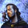
The second one certainly has a more interesting and compelling background, but I feel like the vague-ish coloring job sort of took away some of the fancier details. Of course, you were aiming for a more dramatic look, soo... That said, the lighting & texture on the staff in the second version are really professional-looking and gorgeous.
flysoup's artcorner including the BG fan Comic
#601

Posted 15 January 2010 - 06:53 PM
The second one certainly has a more interesting and compelling background, but I feel like the vague-ish coloring job sort of took away some of the fancier details. Of course, you were aiming for a more dramatic look, soo... That said, the lighting & texture on the staff in the second version are really professional-looking and gorgeous.
#602

Posted 16 January 2010 - 02:20 AM
I really like the first version of that high elf, it's very clean and the coloring is neat. Plus, his face and hair are detailed and quite pretty~

The second one certainly has a more interesting and compelling background, but I feel like the vague-ish coloring job sort of took away some of the fancier details. Of course, you were aiming for a more dramatic look, soo... That said, the lighting & texture on the staff in the second version are really professional-looking and gorgeous.
Thanks for the constructive criticism and you have some good points. Anyway as you said I was looking for more 'drama' in the 2nd edition. But as you mentioned the coloring is a bit vague-ish. I am more used with 'comic' influenced art. Anyway I darkened the image and added some more light sources to increase the drama, also added a warmer filter tune. I remember many of those icewind dale portraits that had a lot of black in them and light sources working very well in contrast creating a dramatic mood/feeling.
Edited by flysoup, 16 January 2010 - 03:04 AM.
#604

Posted 17 January 2010 - 01:37 PM
#605

Posted 17 January 2010 - 11:31 PM
Best of the lot if you ask me. Like the lighter colours and general look and feel of this one.
I also think this one turned out to the better compared to the others. I used my own style in the 3d piece and felt more secure
in what I was doing.
#607

Posted 19 January 2010 - 09:39 AM
Fetish: Backstab Ability (That includes Blackguards!)
Alignment: Mainly Any Evil and, to some extent, Chaotic Neutral
Nemesis:
Aasimar (Unless s/he's evil like Belueth the Calm)
Elf (I just don't like those pointy ears)
Paladin (You could guess why)
Weapon of Choice:
Short Sword/Thrown Daggers + Buckler
#608

Posted 19 January 2010 - 09:50 AM
Nothing beats the historical lessons of the faiths and patheons in artform!
The artwork of comics should be used more often as a learning tool
#609
 -InterestedGuy-
Posted 22 January 2010 - 12:54 PM
That you can paint all this!
Maybe this is the only reply you get from me because maybe I will never find this site again, or just forgot the whole thing..
Ow right btw, don't blame me for my wrong English words if they are in these sentences.
But I know you have that problem to
Keep up the good work!
Greetings from Holland. (You know that small country next to Germany?
#610

Posted 23 January 2010 - 11:47 AM
I really have a lots of respect voor you Micheal, if I read your name well in the upper pages
That you can paint all this!
Maybe this is the only reply you get from me because maybe I will never find this site again, or just forgot the whole thing..
Ow right btw, don't blame me for my wrong English words if they are in these sentences.
But I know you have that problem to
Keep up the good work!
Greetings from Holland. (You know that small country next to Germany?)
I am so thankful for your kind comment, it makes me really happy! Yea I sure know about Holland and would like to go there sometime. They have beautiful old towns, landscapes, oh and a great soccer team as well
#611

Posted 29 January 2010 - 12:20 AM
#613

Posted 02 February 2010 - 11:36 AM
Artwork/Script: Michael Hansson Script/Script Edit: prune 1
#614

Posted 10 February 2010 - 11:30 AM
http://4.bp.blogspot...omic_edit06.jpg
Edited by flysoup, 10 February 2010 - 11:39 AM.
#615

Posted 14 February 2010 - 02:54 AM
http://ballukas.devi...conia-154057349
Edited by flysoup, 14 February 2010 - 02:56 AM.
#616

Posted 23 February 2010 - 02:31 PM
http://4.bp.blogspot...awn-jpeg-10.jpg
Artwork/Script: Michael Script/Script Edit: prune1
#617

Posted 28 February 2010 - 10:50 PM
Thank you all for the feedback and encouraging words. You have all helped to inspire me and to make me develop!
Good speed!
#618

Posted 06 March 2010 - 06:00 AM
#619

Posted 09 March 2010 - 12:31 PM
I know that sundays is the mentioned update day of the Bhaalspawn webcomic. But I couldn't stop myself from updating in advance. So what are you waiting for, quit reading my ramblings and head in to: http://bhaalspawn.com/ for the latest page or read from the beginning if you are a newcomer.
Good speed and safe adventuring/
Michael H Bhaalspawn
#620

Posted 09 March 2010 - 02:16 PM
I wish all candlekeep library was in comic!
My Deviant Art accountIf you want to alter reality, you must first escape from it.


