
Naaah, the red is just the guy's paint coming off. He is just pissed at the cost for a new set of paint for such armour.
Icen

Das Neues Legion Sketch Thread
Started by WeeRLegion, Jul 17 2008 12:08 PM
159 replies to this topic
#62

WeeRLegion
-
- Member
- 2925 posts
TFP : D
Posted 30 November 2008 - 04:05 PM
Ack, Icen's got it right this time. .p
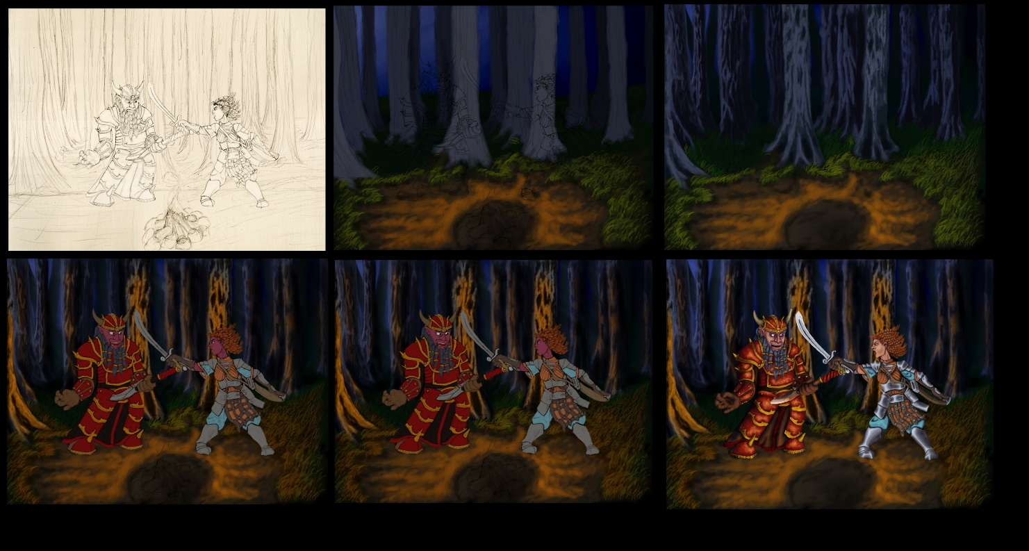
as it happened, I just did a bit o' overkill on the chippination. .p
Also I should have used a much darker base-tone for the metal, it came off a bit too much like fresh-brushed stainless-steel, when I was actually going for a forged, hammered and worn look. .p
Actually, one of my goals with that pic was to create a 'perfect' method for giving texture to plate armors... I did get a step closer I think. .p
Edited by WeeRLegion, 30 November 2008 - 04:07 PM.
#63
Silinde Ar-Feiniel
-

- Member
- 488 posts
Posted 30 November 2008 - 04:18 PM
 I guess i was wrong then. You should indeed use a darker base-tone for the metal because it looks like a shiny new armor to me. Your texture work is great though.
My Deviant Art accountIf you want to alter reality, you must first escape from it.
#64
WeeRLegion
-
- Member
- 2925 posts
TFP : D
Posted 06 December 2008 - 01:43 PM
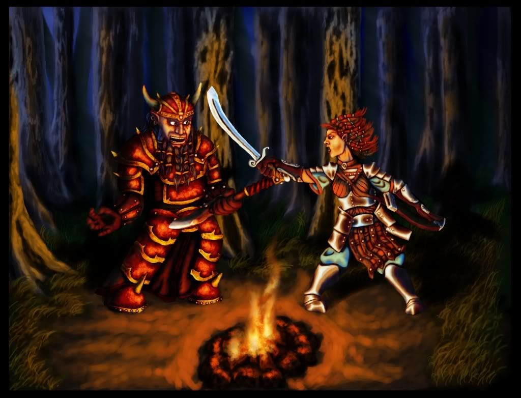
For anyone interested, here's a WIP progression of the Korgan-Harassing-Rabid-Mazzy piece. 
Also, a link to the FINALFINAL version of the pic; don't think there's much left to correct now:
Link
Also, a link to the FINALFINAL version of the pic; don't think there's much left to correct now:
Link
Attached Images
Edited by WeeRLegion, 06 December 2008 - 01:49 PM.
#65
Aliya
-
- Member
- 1619 posts
Pink-Eyed Menace!
Posted 06 December 2008 - 01:46 PM
WIP? I very good technique!
#66
WeeRLegion
-
- Member
- 2925 posts
TFP : D
Posted 06 December 2008 - 02:06 PM
Thanks. :]
WIP = Work In Progress
WIP = Work In Progress
#67
Silinde Ar-Feiniel
-
- Member
- 488 posts
Posted 06 December 2008 - 02:20 PM
Thanks WeeR! That's a great help! I should really study your technique! The way you make trees is cool! Do you use lower opacity and flaw, for the colors beyond the base color? Could you refer to some simple steps on it?
My Deviant Art accountIf you want to alter reality, you must first escape from it.
#68
WeeRLegion
-
- Member
- 2925 posts
TFP : D
Posted 06 December 2008 - 03:18 PM
I'll try to do some sorta visual demonstration on that tomor... later today. .p
Gotta go to sleep in a... well, I should be gonig to sleep right now, but there's still a few little things I want to do. .p
Er, no, I did not alter the brush settings between colors on the trees, the basic steps are:
-Basic shape
-Basic rough, heavy-handed highlights (keep in mind direction of light; less highlights on the dark side, otherwise the color will turn out bland)
-Texturing highlights with a smaller brush (Zoom in close and roughly trace the light-side outlines of the previous highlights, also just, randomly brush here and there to create a texture, just stay away from the darkest shadows)
-Deepen the shadows for balance (The tree is probably quite bright by now for all that highlighting. Again, keep in mind direction of light)
-Add the final shiniest highlights on top of the previous highlights @_@
**The orange shininess was applied with an orange 'Add Color' layer
The colors are basically a bluish-gray for the shadows with a hint of green mixed in for the highlights; nothing too saturated, essentially grey with a hint of color on it.
Looks kinda 'Swampy' - rotten dead upright.
#69
Silinde Ar-Feiniel
-
- Member
- 488 posts
Posted 06 December 2008 - 03:34 PM
I like the swampy rotten dead look!
A visual demonstration would be great! Thanks for explaining!
A visual demonstration would be great! Thanks for explaining!
My Deviant Art accountIf you want to alter reality, you must first escape from it.
#70
WeeRLegion
-
- Member
- 2925 posts
TFP : D
Posted 06 December 2008 - 04:11 PM
Oh yes, and I'll have to correct myself; I kept the green tint only in the midtones; the sharpest highlights are kinda light bluish, pretending to be lit by the moon or something, night ambience.
And the tint is VERY slight. xP
And the tint is VERY slight. xP
Edited by WeeRLegion, 06 December 2008 - 04:12 PM.
#71
WeeRLegion
-
- Member
- 2925 posts
TFP : D
Posted 08 December 2008 - 02:30 PM
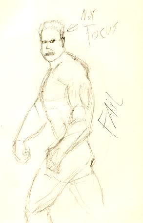
Just a lil update on what I've been up to; Drawing from reference!
In chronological order:
This one failed:
This one did not fail quite as bad:
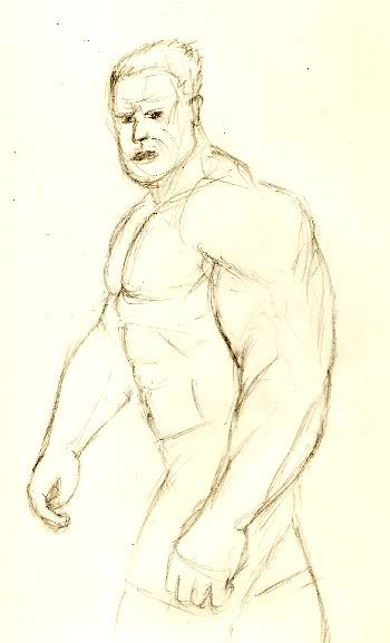
This one turned out decently:
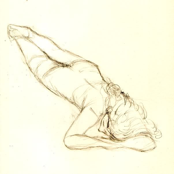
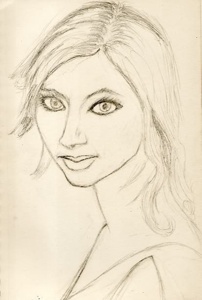
Hmmm... One of my better face portraits, but still, it's not quite good enoguh. @_@
Aaannnddd...
(NOT from reference .p)
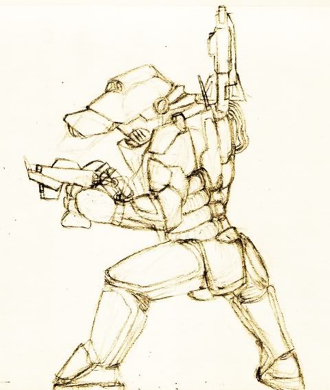
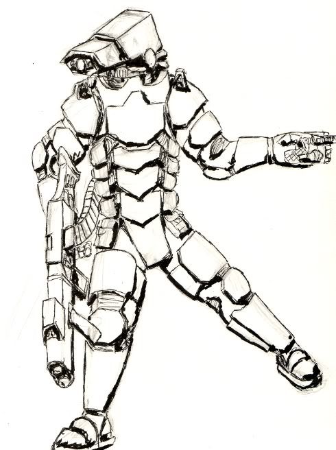
A power armor concept:
In chronological order:
This one failed:
This one did not fail quite as bad:
This one turned out decently:
Hmmm... One of my better face portraits, but still, it's not quite good enoguh. @_@
Aaannnddd...
(NOT from reference .p)
A power armor concept:
#72
Silinde Ar-Feiniel
-
- Member
- 488 posts
Posted 08 December 2008 - 03:18 PM
Welldone, the last ones are quite good!
My Deviant Art accountIf you want to alter reality, you must first escape from it.
#73
WeeRLegion
-
- Member
- 2925 posts
TFP : D
Posted 09 December 2008 - 03:11 PM
Danks m8!
Here's the latest:
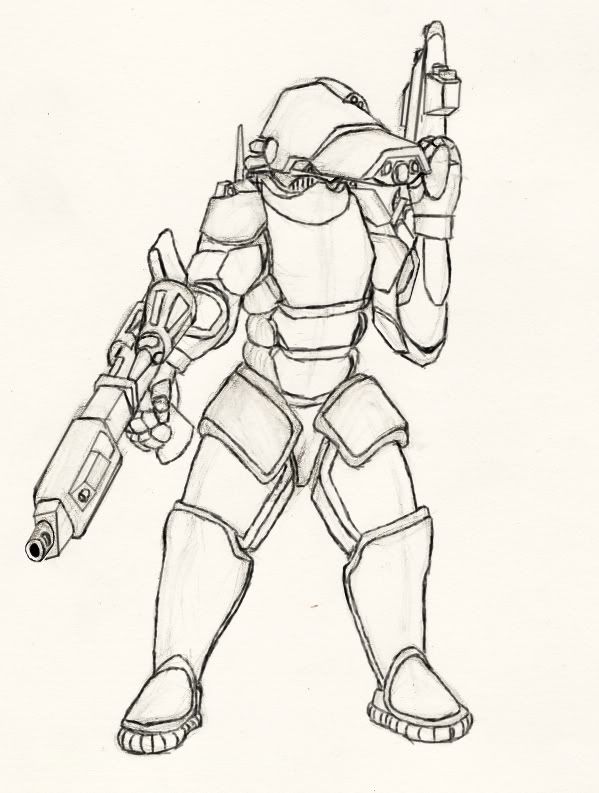
Here's the latest:
#74
Kellen
-
- Member
- 7092 posts
Earn a person's heart, and they'll die a thousand deaths

Posted 10 December 2008 - 04:07 PM
T'au?
Also, I'm enjoying browsing through your thread every time you get a new pic, and would have posted a lot sooner if I had anything to say besides that.

Also, I'm enjoying browsing through your thread every time you get a new pic, and would have posted a lot sooner if I had anything to say besides that.
"She could resist temptation. Really she could. Sometimes. At least when it wasn't tempting." - Calli Slythistle
"She was a fire, and I had no doubt that she had already done her share of burning." - Lord Firael Algathrin
"Most assume that all the followers of Lathander are great morning people. They're very wrong." - Tanek of Cloakwood
we are all adults playing a fantasy together, - cmorgan
"She was a fire, and I had no doubt that she had already done her share of burning." - Lord Firael Algathrin
"Most assume that all the followers of Lathander are great morning people. They're very wrong." - Tanek of Cloakwood
we are all adults playing a fantasy together, - cmorgan
#75
WeeRLegion
-
- Member
- 2925 posts
TFP : D
Posted 11 December 2008 - 04:03 AM
Mmm, second time I've heard that, 'Tau'. .p
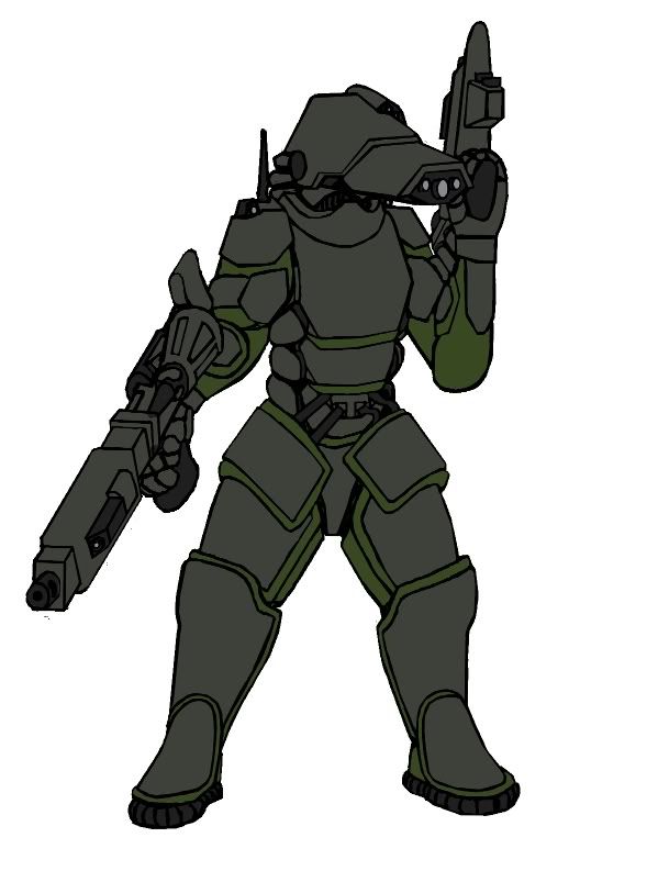
I guess it's the helmet design that's vaguely Tauish; with no facial shapes discernible and only a buncha lenses there.
But nahh, ish fully original, i swears.
So, ah, thanks for commenting m8! Yarrr! :]
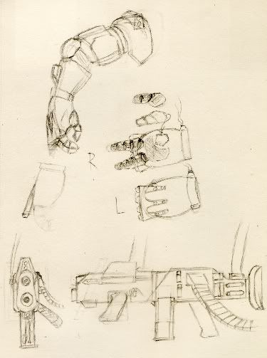
Also, here's some progress on the armor:
I guess it's the helmet design that's vaguely Tauish; with no facial shapes discernible and only a buncha lenses there.
But nahh, ish fully original, i swears.
So, ah, thanks for commenting m8! Yarrr! :]
Also, here's some progress on the armor:
#76
WeeRLegion
-
- Member
- 2925 posts
TFP : D
Posted 11 December 2008 - 03:41 PM
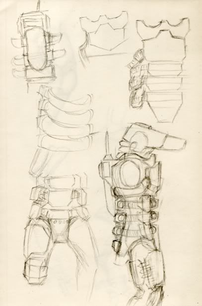
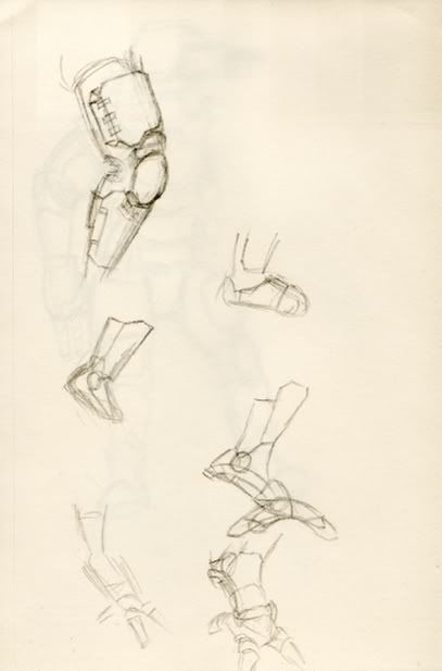
Due to some critique elsewhere about the previous concept, I'm doing a partial redesign. .p
Here's an idea dump:
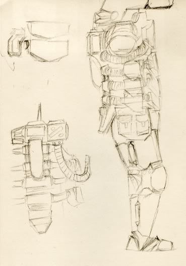
I'll prolly get something more solid done tomor... later today. xP
@_@
Here's an idea dump:
I'll prolly get something more solid done tomor... later today. xP
@_@
Edited by WeeRLegion, 11 December 2008 - 03:42 PM.
#77
Kellen
-
- Member
- 7092 posts
Earn a person's heart, and they'll die a thousand deaths
Posted 11 December 2008 - 08:06 PM
"She could resist temptation. Really she could. Sometimes. At least when it wasn't tempting." - Calli Slythistle
"She was a fire, and I had no doubt that she had already done her share of burning." - Lord Firael Algathrin
"Most assume that all the followers of Lathander are great morning people. They're very wrong." - Tanek of Cloakwood
we are all adults playing a fantasy together, - cmorgan
"She was a fire, and I had no doubt that she had already done her share of burning." - Lord Firael Algathrin
"Most assume that all the followers of Lathander are great morning people. They're very wrong." - Tanek of Cloakwood
we are all adults playing a fantasy together, - cmorgan
#78
WeeRLegion
-
- Member
- 2925 posts
TFP : D
Posted 12 December 2008 - 08:54 AM
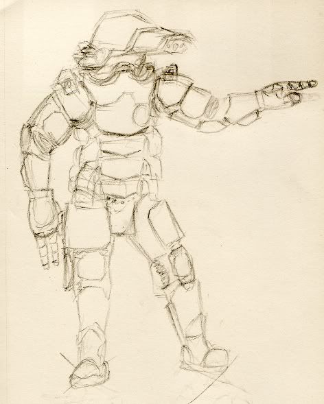
Yea, I know, but it's not really all THAT similar. It's pretty much the optical lens up front, and thass that. @_@
Anyway, more of the same, Ima gonna do this thing properly or not at all. .p
Soo, practice:
Anyway, more of the same, Ima gonna do this thing properly or not at all. .p
Soo, practice:
#79
Aliya
-
- Member
- 1619 posts
Pink-Eyed Menace!
Posted 12 December 2008 - 09:54 AM
Oohh... Some sci-fi?
#80
WeeRLegion
-
- Member
- 2925 posts
TFP : D
Posted 12 December 2008 - 10:12 AM
Well, you don't see paladins of helm walking around in suits like that, do ya? 


